Many Big Corporates are promoting social distancing to interpret by redesigning the Logo. The Concept becomes more popular in Large Corporate for awareness of social distancing due to spreading of Coronavirus. Social distancing means stand 6 feet away from others which is a highlight from the redesign of the Logo of the respective Company and Group. By redesigning of Logo, Corporate wants to promote social distancing which clearly observed from revised Logo.
#1 Mcdonald has separated its golden arches to encourage safety by promoting social distancing against Corona pandemic.
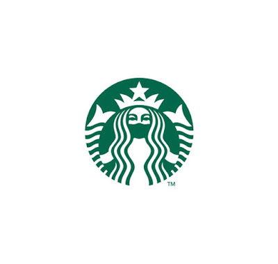
Image credit: Mudhesh#2 Starbucks Coffee has promoted social distancing by separating a queen from the Logo.
Image credit: Nasreena
Starbucks Coffee Queen also wore Mask to promote social distancing
Image credit: Syieddy
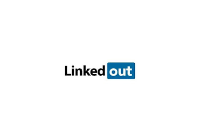
#3 Linkedin has changed its logo to Linkedout. How brand promoting social distancing!
Image credit: Alebachew
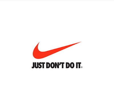
#4 Nike has also very well explained the concept of social distancing through the revised logo.
Image credit: Syieddy
#5 Master Card has separated round shape from the Logo,
Image credit: Neer_Dose
#6 Coco Cola has make space in its brand logo to promote social distancing.
Image credit:cherelle
#7 Audi separated ring to encourage keep distance for promoting safety against Coronavirus.
Image credit: KanbutsuyaSan
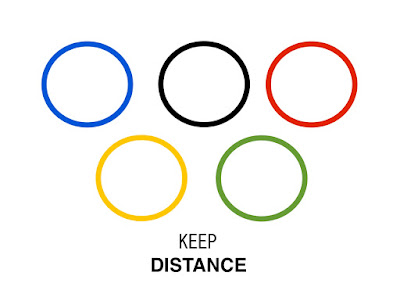
#8 Olympic Game has also this time changed the logo to encourage for social distancing.
Image credit: KanbutsuyaSan
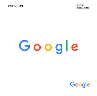
#9 Google has increase space between character to promote social distancing.
Image credit: bleckdezigns
#10 Microsoft logo to promote social distancing
Image credit:bleckdezigns





Comments
Post a Comment